
“Make the site responsive” is too vague for a dependable coding task. A better starting point is one visible failure, a reproducible route and a clear target. This walkthrough uses a four-column article grid that overflows on mobile as the example.
Checked: 10 November 2026. Features and menu labels can vary by plan, workspace and rollout.
Before you start
A recoverable local or staging copy of the WordPress code, Codex access to the relevant project and a way to open the site in a browser. Keep production credentials out of prompts. The example below describes a testing method; it does not assume your theme uses a particular selector.
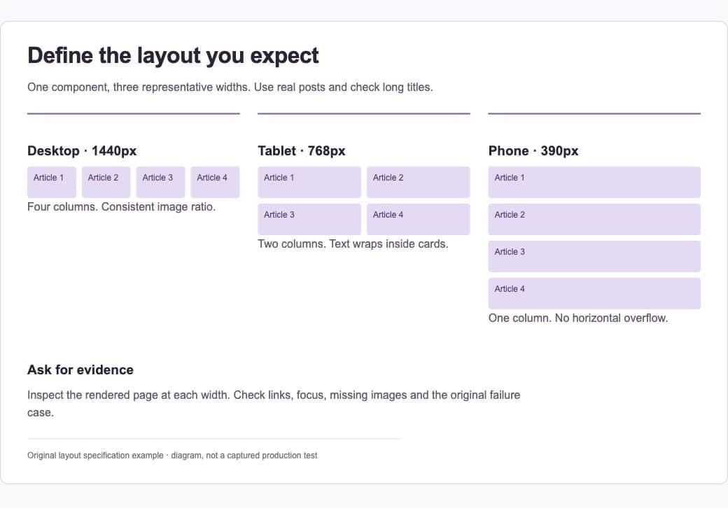
1. Describe the failure precisely
Provide the affected URL or template, viewport width and what goes wrong. Include a screenshot when useful. State the expected result: four columns on desktop, two on a tablet and one on a narrow phone, with long titles wrapping inside each card.
2. Ask Codex to inspect first
Have it locate the template and styles that actually control the grid. Ask for a likely cause and a short plan before editing. Common causes include fixed child widths, grid tracks that cannot shrink and inherited margins, but the agent should establish which one applies to your implementation.
3. Set the scope
Limit the change to the affected archive and shared rules that genuinely govern it. Ask it to preserve links, keyboard focus, image ratios and existing content. State which generated or vendor files should not be edited. Put durable repository rules in AGENTS.md if the project uses one.
4. Review the proposed patch
Inspect the actual diff. Check that selectors are scoped and that a breakpoint does not accidentally change every grid on the site. For a CSS Grid implementation, minmax(0, 1fr) and min-width: 0 can be appropriate ways to allow shrinking, but they are not universal fixes.
5. Open the rendered result
Check representative widths such as 1440, 768 and 390 pixels, plus any width where the original failure occurred. Look at the actual content, not only a grid outline. Test a long title, a missing image and several cards. Confirm that the document has no horizontal overflow.
6. Finish with evidence
Run checks relevant to the code changed and review the browser result. Ask Codex to report the files changed, behaviour verified and anything still uncertain. Deploy only after reviewing the patch and keeping a recovery path. A code change that looks plausible is not a verified live fix.
A prompt to adapt
Inspect this WordPress archive layout before editing. At [URL and width], [observed failure]. Expected: [behaviour]. Find the controlling template and CSS, explain the cause and propose the smallest coherent fix. Keep changes scoped. After editing, inspect desktop, tablet and mobile renders, long titles, missing images and keyboard focus. Report the actual checks and any limits. Do not deploy to production.
Check the result
Compare before and after at the same width and with the same posts. Read the diff for unrelated changes. If a test cannot run, preserve that uncertainty in the handover. Do not let a successful build substitute for opening the affected page.
Common questions
Should I add another mobile-only override?
Only after understanding the existing rules. Layers of overrides can hide the cause and produce failures at intermediate widths. Prefer a coherent rule in the component or template that owns the layout.
How much testing is enough?
Test the behaviour the change can affect. A small archive CSS fix usually needs meaningful visual and interaction checks rather than a large suite of tests that simply repeats the new CSS values.
Official references
Keep going
Write useful AGENTS.md instructions so the next coding task starts with the same project rules. You can also build a first brief with our free prompt generator.